See also the general guidelines in Typography.
When to use
- To communicate information.
- To control the visual styling of text.
- Only sparingly to add necessary information with a clear purpose.
When not to use
- To add structure and divide screens into sections—use a heading.
Component status
Figma | React | iOS | Android |
|---|---|---|---|
Released | Released | Released | Released |
Content structure
Look & feel
Base everything off normal primary
Start with normal-sized, primary, unweighted text. Then add importance first with size and then weight. Show less important things first with smaller text and then with secondary color.
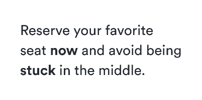
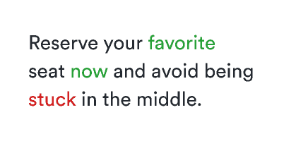
Keep all text in a block one color
Inside a paragraph, all the text should be the same color. To emphasize something, use a stronger weight.
Do
Use weight for emphasis.
Don't
Don’t use color for emphasis.
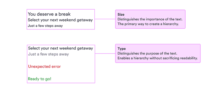
Text size
The basic styling options for text are the three possible sizes (, , and ). These sizes should give you a clear hierarchy for all your text.
Using only these sizes should be enough for the basics. When you have a hierarchy set, you can use color and weight to emphasize certain parts and de-emphasize others.
Text color
There are two main colors to work with: primary () and secondary ().
Start with primary text as your baseline. Then if you need to de-emphasize some text (which is a good way of emphasizing other text), use secondary text to show that it’s not as important.
We also have supplementary colors for when you need to match text to a specific status (as in alerts) or when you’re writing on a dark background.
Text weight
When size and color aren’t enough or when you need to emphasize text inside a larger paragraph, you can use weight to add emphasis.
There are only two possible weights for text: normal and bold. In combination with size and color, this should be enough for all your needs. (See Figma-specific guidelines for more on weights there.)